Client Project

Client Project

Navigating Nuance: Optimizing World Vision's Sponsor App for iOS and Android Launch

Navigating Nuance: Optimizing World Vision's Sponsor App for iOS and Android Launch

Navigating Nuance: Optimizing World Vision's Sponsor App for iOS and Android Launch

Project Details

Project Details

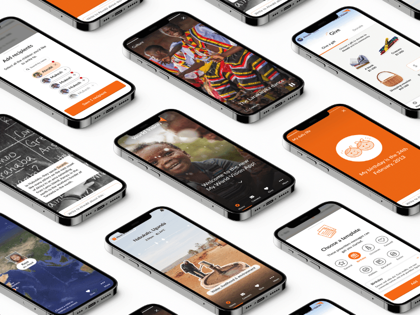
Client: World Vision

Industry: Non-profit

Role: Product Design Consultant

Product: iOS & Android apps

Timeline: 3 weeks

Project Summary:
Cross-Platform Optimization Strategy

Project Summary:
Cross-Platform Optimization Strategy

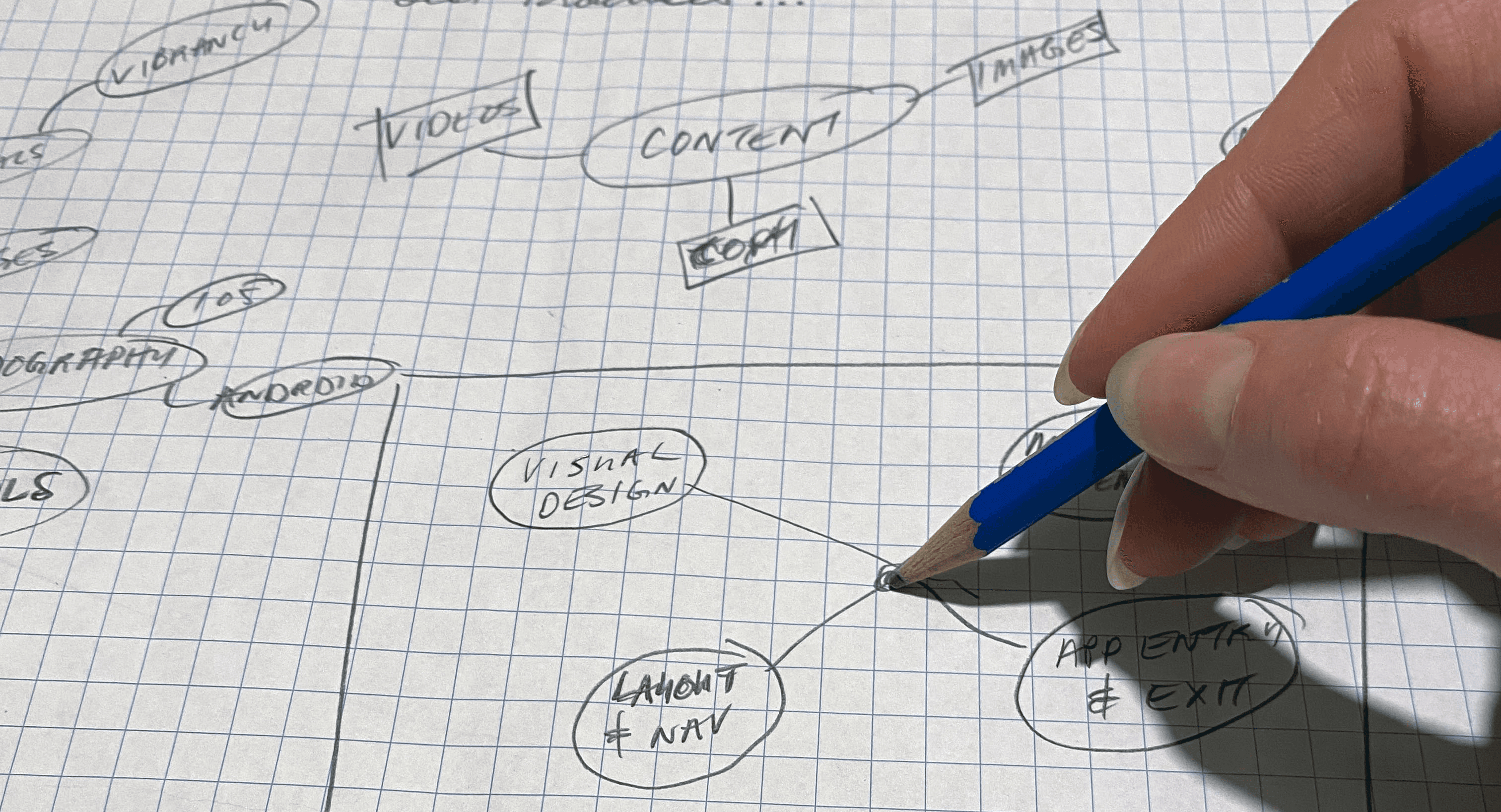
Over a 3-week sprint, a "cross-platform optimization" strategy was created for the launch of World Vision's very first sponsor app. The role focused on recommending UX/UI changes that would strike a balance between:

  1. The nuances and intricacies of iOS and Android platforms and the relevant differences between them;

  2. The business goals, available team resources and the current state of the app design.

The Problem: iOS and Android version of app not aligned with platform specific guidelines…

The Problem: iOS and Android version of app not aligned with platform specific guidelines…

The original design of World Vision's sponsor app overlooked a variety of differences between iOS and Android platforms and design guidelines, resulting in a single version that failed to adapt to the unique user experiences of each.

The Solution: 20 UX/UI recommendations that empowered the product team to move forward with final improvements for the launch…

The Solution: 20 UX/UI recommendations that empowered the product team to move forward with final improvements for the launch…

Rather than designing custom versions of the app for each platform (which would be time consuming and costly), the approach focused on strategic design changes that would ensure iOS and Android compliance while providing a product roadmap that would be achievable before the launch date.

Phase 1: took inventory of 200+ iOS/Android Guidelines and audited app for guideline compliance

Apple's Human Interface Guidelines (HIG) and Google's Material Design were used as benchmarks. Every guideline from both sources was inventoried into a database and determined to be relevant (or not) to the app. Then the app was audited against all relevant guidelines for compliance.

Phase 1: took inventory of 200+ iOS/Android Guidelines and audited app for guideline compliance

Image: spreadsheet where inventory and audit were performed and documented.

Image: spreadsheet where inventory and audit were performed and documented.

Apple's Human Interface Guidelines (HIG) and Google's Material Design were used as benchmarks. Every guideline from both sources was inventoried into a database and determined to be relevant (or not) to the app. Then the app was audited against all relevant guidelines for compliance.

Phase 2: synthesized problems into 4 categories that applied to both the iOS and Android versions of the app

The app was originally designed and developed as one app, and built in ReactNative therefore the problems had to be presented in a way that aligned with this "high parity" approach. The categories offered a simple way of telling the story of the overall challenges while leaving room within each recommendation for the nuances of iOS and Android to be addressed.

Phase 2: synthesized problems into 4 categories that applied to both the iOS and Android versions of the app

Image: sketch of initial themes mapping to find commonalities.

Image: sketch of initial themes mapping to find commonalities.

The app was originally designed and developed as one app, and built in ReactNative therefore the problems had to be presented in a way that aligned with this "high parity" approach. The categories offered a simple way of telling the story of the overall challenges while leaving room within each recommendation for the nuances of iOS and Android to be addressed.

Phase 3: wrote the UX/UI recommendations

After the categories had been defined, the UX/UI recommendations were written, focusing on tangible and practical changes that the team could make before launch. Recommendations included a breakdown of the problem, its impact, the changes that were recommended for both iOS and Android, as well as resource links for the team to reference.

Phase 3: wrote the UX/UI recommendations

Phase 3: wrote the UX/UI recommendations

After the categories had been defined, the UX/UI recommendations were written, focusing on tangible and practical changes that the team could make before launch. Recommendations included a breakdown of the problem, its impact, the changes that were recommended for both iOS and Android, as well as resource links for the team to reference.

Image: recommendation for the "irreversible action warning".

Image: recommendation for the "irreversible action warning".

After the categories had been defined, the UX/UI recommendations were written, focusing on tangible and practical changes that the team could make before launch. Recommendations included a breakdown of the problem, its impact, the changes that were recommended for both iOS and Android, as well as resource links for the team to reference.

Phase 4: communicated the recommendations to the team

Phase 4: communicated the recommendations to the team

The goal of the final recommendations presentation was to give the team the direction and information they required to take action. Recommendations were organized into one of the 4 categories (areas), and then broken down further with details pertaining to each. All recommendations were summarized at the end to provide a macro look at what needed to be actioned on.

Image: example of "area" page detailing each category and the recommendations in each.

Image: example of a recommendation page, including details on the problem, the recommendation, priority level and helpful links.

Image: summary of all recommendations, presented at the end of the deck as a takeaway artifact for roadmap planning.

Image: summary of all recommendations, presented at the end of the deck as a takeaway artifact for roadmap planning.


The goal of the final recommendations presentation was to give the team the direction and information they required to take action. Recommendations were organized into one of the 4 categories (areas), and then broken down further with details pertaining to each. All recommendations were summarized at the end to provide a macro look at what needed to be actioned on.